Graphs
What's on the Graphs page?
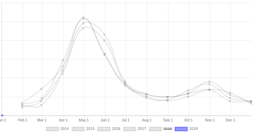
The Graphs report charts several years of sales history as line graphs, one line per year (the current year in blue): Sales $ (in thousands), Gross Margin $ (in thousands), Gross Margin %, # Receipts, and Average Receipt $. The monthly view covers up to 10 years of history; the weekly view covers up to 3 years.
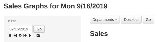
Choose department... — select any number of departments and/or sub-departments (listed as "Department / Sub-department") to chart only those; leave the selector empty to chart all sales. If your account has more than one division, a Choose division... selector appears as well. Pick Monthly or Weekly from the period dropdown, then click Go to redraw the graphs.
Tip
Click a year in the legend at the bottom of a graph to hide or show that year's line.
Tip
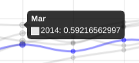
Hover over data points to see the corresponding value, as shown below