Graphs
What's on the Inventory Graphs Page?
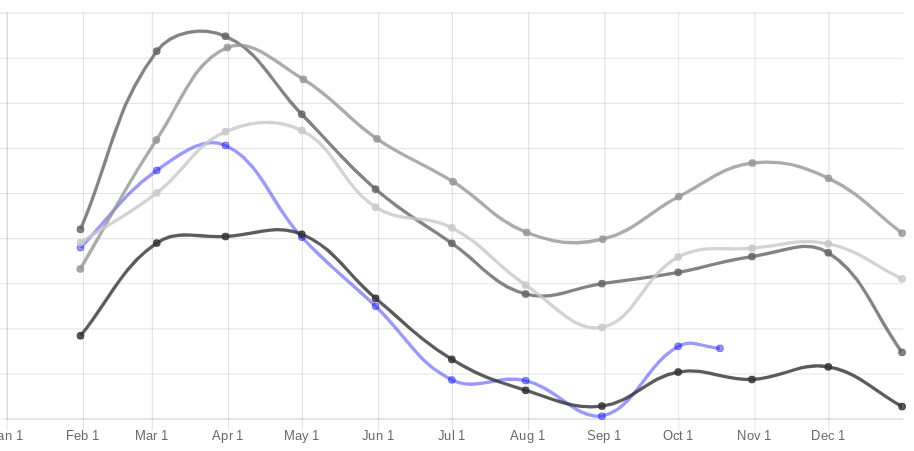
The Inventory Graphs report shows two line charts:
- Cost of Inventory — your total cost of inventory over the course of the year, with one line per year so you can compare against past years. The current year is drawn in blue; older years fade to gray.
- Cost of Inventory by Department / Sub-Department — the current year's cost of inventory broken out with one line per selected department or sub-department.
Values on both graphs are plotted in thousands of dollars.
Filtering the Inventory Graphs
- Departments — Use the drop-down to select any number of departments and/or sub-departments. Leaving nothing selected includes all departments (the Cost of Inventory graph shows their combined total).
- Monthly / Weekly — Choose whether each data point is the end of a month (Monthly, showing the current year plus up to 9 prior years) or a week (Weekly, showing the current year plus up to 3 prior years).
- Click Go to repopulate the graphs with your selections. They will automatically re-scale.
Tip
Click a year in the key at the bottom of the graph to hide or show that year's line.
Tip
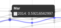
Hover over data points to see the corresponding value, as shown below